Museum Interior Design: Create Gallery-Worthy Spaces in Your Home in 2026
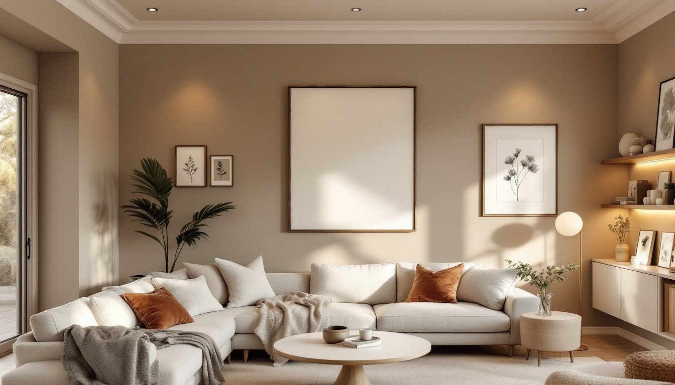
Museum <a href="https://lesssea.com/category/interior-design/”>interior design isn’t just for institutions anymore. Homeowners and design enthusiasts are borrowing curated gallery principles to transform living rooms, bedrooms, and entryways into intentional, museum-quality spaces. The appeal is real: museums spend decades perfecting how light, layout, and color guide a visitor’s eye and create emotional resonance. By applying these same techniques at home, you can elevate everyday rooms into spaces that feel intentional, gallery-worthy, and distinctly yours. Whether you’re displaying a collection of artwork, family photography, or meaningful objects, museum design principles teach us how to make even modest spaces feel elevated and purposeful.
Key Takeaways
- Museum interior design principles, including intentional lighting and negative space, transform ordinary home spaces into sophisticated, gallery-worthy rooms that feel calm and purposeful.
- Three-tier lighting—ambient, task, and accent—recreates professional gallery lighting at home; use dimmers set to 30–40% capacity for ambient light and directional accent lighting at 30-degree angles to artwork.
- Start with a neutral wall color like warm whites, soft grays, or warm taupes to let displayed objects dominate, and test large paint swatches in different lighting conditions before committing to a color.
- Create focal points by concentrating artwork on one primary wall, use kraft paper templates to test layouts before hanging, and vary vertical heights to establish visual rhythm and intention.
- Lighting quality matters most: museum-grade LED picture lights with 95+ CRI preserve artwork and prevent fading, while portable track lights let you experiment before permanent installation.
- Treat negative space as an intentional design element, not wasted wall; breathing room between curated pieces amplifies visual impact and creates a sense of deliberate curation.
Why Museum Design Principles Transform Home Spaces
Museums are masters of visual communication. Every wall color, fixture placement, and sightline is calculated to guide visitors and amplify the impact of what’s on display. That discipline translates perfectly to residential design.
Museum curators understand negative space, the wall area around and between objects. They use it as a design tool, not wasted real estate. A single painting on a large white wall commands more attention than five paintings crammed onto the same surface. At home, this means resisting the urge to fill every inch. Instead, breathing room amplifies visual impact.
Lighting is another cornerstone. Galleries don’t just illuminate rooms: they sculpt visual hierarchy through directional, layered light. Certain pieces get spotlights. Pathways get ambient glow. This approach prevents monotony and guides attention where it matters. A study published by museum design professionals shows that 60% of visitor engagement stems from lighting choices, not the artwork itself.
Museums also embrace restraint in color. Most galleries use neutral backdrops, whites, soft grays, warm taupes, so displayed objects remain the stars. This principle works at home too. When exploring interior design apps for planning, many professionals stress starting with a neutral base and adding accent colors through removable, changeable elements: art, textiles, and accessories.
The psychological benefit is tangible: spaces designed with intention feel calm and sophisticated. Clutter triggers mental fatigue. Curated spaces feel restful, even in busy homes.
Lighting Techniques From Professional Galleries
Professional galleries use three-tier lighting: ambient, task, and accent. Recreating this at home requires understanding each layer and choosing fixtures that deliver control.
Ambient lighting provides baseline illumination, typically ceiling fixtures, recessed lights, or indirect sources. In a gallery, this is often dimmed to 30–40% of full capacity. At home, install dimmers on overhead lights to match this gallery standard. A standard 60-watt equivalent LED bulb consumes 9 watts and produces 800 lumens: dimmers extend bulb life and let you adjust mood instantly.
Task lighting illuminates specific functional areas: reading nooks, desks, or shelving. Wall sconces flanking a mirror or pendant lights over a console work here. Ensure task lighting doesn’t spill onto displayed artwork and create glare.
Accent lighting highlights the stars, artwork, collections, or architectural features. This is where galleries shine. Picture lights clamped atop frames, track lighting with adjustable heads, or small spotlights in recessed housings all work. The key is directionality. Light should hit the subject at a 30-degree angle to minimize glare and shadow.
Accent Lighting for Artwork Display
Artwork deserves dedicated attention. Museums use museum-grade LED picture lights rated 95+ CRI (Color Rendering Index) to avoid color distortion. These aren’t cheap, expect $150–400 per fixture, but they preserve paint and prevent fading better than standard bulbs.
Alternatively, recessed eyeball lights (rotating trim rings in recessed housings) offer flexibility and clean aesthetics. They cost $30–60 per unit and work well for rotating displays or rearrangement. Position them 18–24 inches from the wall to avoid harsh shadows.
If artwork sits on shelves or ledges, use small LED strip lights behind the front edge of shelving. This uplight technique, common in high-end retail, creates depth and drama. Low-voltage LED strips are energy-efficient and generate minimal heat.
Always test lighting before committing to permanent fixtures. Use portable track lights or clip-on picture lights first. This lets you see how light interacts with color and texture, the same approach museums use during installation.
Wall Layouts and Curation Strategies
Gallery walls aren’t random. Museums plot sightlines, traffic flow, and the sequence of visual experiences. Applying this to a home hallway, living room, or entryway requires planning.
Start with a focal wall, the surface visitors naturally see when entering the space. This becomes your primary display zone. Secondary walls support the narrative without competing. Avoid scattering artwork evenly across all walls: instead, concentrate it where it matters most.
Measurement is non-negotiable. Professional curators use templates and tape to test layouts before hanging anything. Cut kraft paper to match frame sizes, tape it to the wall, and live with the arrangement for 24 hours. This prevents costly drywall holes and second-guessing.
Galleries also think vertically. Don’t limit yourself to waist-height placements. Eye level for a seated person is around 48 inches from the floor: for standing, it’s 57–60 inches. Mix heights to create visual rhythm. A horizontal line of smaller frames, punctuated by one large piece, feels more intentional than uniform spacing.
Creating Focal Points and Visual Flow
A focal point anchors the room. This might be a large painting, a shadow box collection, or an architectural feature. The focal point should be the first thing your eye lands on when entering, typically centered on the dominant wall or positioned to catch light.
From the focal point, create visual flow. Smaller pieces can lead the viewer’s eye in a path. Museums often arrange work chronologically, thematically, or by color intensity. At home, you might cluster family photos by decade, arrange botanical prints in size gradation, or group art by color families. The logic doesn’t matter as much as consistency: visitors (and you) should sense the intention.
Balancing asymmetry requires restraint. Museums often place a single statement piece on one side and leave the rest open. This asymmetry feels deliberate, not accidental. By contrast, heavy symmetry (two identical pieces flanking a center element) works too, it’s formal and calming.
Consider negative space as a design element, not wasted wall. A cluster of five pieces with breathing room between them draws more engagement than eight pieces squeezed together. When mastering interior design presentation, professionals emphasize white space as essential to clarity.
If you’re starting from scratch, test your vision using interior design inspiration from sources like Homedit, which aggregates curated interiors and room layouts. Save images of gallery-style arrangements you admire, then reference them during your planning phase.
Color Palettes and Finish Selection
Museum walls are typically white, cream, soft gray, or warm taupe. These colors serve a purpose: they’re neutral enough to let displayed objects dominate but warm enough to avoid a sterile feel. Pure white can feel clinical: softer neutrals like Benjamin Moore Accessible Beige or Sherwin-Williams Accessible Beige ($40–60 per gallon) create sophistication without coldness.
Warm grays, those with underlying beige, tan, or brown undertones, outperform cool grays in residential settings. Cool grays (with blue or purple undertones) feel institutional. Museum professionals lean warm for this reason.
If solid neutrals feel too safe, consider tone-on-tone: a single color in varying saturation levels. Walls in a soft gray-green paired with trim in a slightly deeper gray-green creates subtle dimension without competing with artwork. This technique is popular in high-end galleries and hotel lobbies.
For finishes, choose eggshell or satin for wall paint. These sheens hide minor imperfections better than matte and clean more easily than glossy. For trim and shelving, satin or semi-gloss resists dust and fingerprints, important if you’re displaying objects that require handling.
Proper prep is critical. Most paint failures stem from inadequate surface preparation. Sand any glossy paint, fill holes, and prime bare drywall. Use a quality primer rated for your surface (drywall primer, shellac for stained wood, etc.). One gallon of paint covers roughly 350 square feet: a typical bedroom needs 2–3 gallons including trim.
When choosing colors, sample multiple shades. Paint large swatches (at least 2 feet square) on different walls and observe them in morning and evening light. Paint color appears different depending on surrounding light, a gray that looks sophisticated at noon might look muddy under evening incandescent light. This same discipline curators apply when selecting gallery walls will save you time and money.
Accent colors enter through display items: framed art, textiles, books, and collected objects. These provide visual interest while keeping walls as a calm, neutral backdrop. This approach aligns with how leading design publications like Curbed feature gallery-inspired homes.
Conclusion
Museum design principles, intentional lighting, deliberate layout, and restrained color, translate directly to home spaces. By borrowing gallery techniques, even modest rooms gain sophistication and purpose. Start with one focal wall, invest in proper lighting, choose a warm neutral backdrop, and curate thoughtfully. The result isn’t a sterile showroom: it’s a home that feels intentional, calm, and gallery-worthy. Your space will feel like a personal museum, one designed around what matters to you.