![]()

Black And White Interior Design: Create Timeless Contrast In Your Home For 2026
Black and white interior design is far more than a safe play for homeowners nervous about color commitment. It’s a sophisticated, deliberately crafted approach to defining space, depth, and visual hierarchy in a home. Whether you’re working with a blank rental apartment or planning a full kitchen overhaul, black and white design offers measurable advantages: it amplifies light, creates psychological clarity, and adapts to almost any architectural style, from mid-century modern to farmhouse to contemporary. Unlike trendy color palettes that fade in five years, this timeless contrast stands the test of time. The real skill isn’t finding black and white paint: it’s knowing how much of each, where to place pattern and texture, and which rooms benefit most from bold definition.
Key Takeaways
- Black and white interior design is a timeless, sophisticated approach that amplifies light, creates psychological clarity, and works across any architectural style without fading like trendy palettes.
- The 60-30-10 design rule balances visual weight in black and white rooms: roughly 60% neutral white or light gray, 30% black or charcoal, and 10% pattern or texture to avoid monotony.
- Texture and pattern separation distinguish layered, intentional black and white interiors from flat, hotel-like spaces—use varied finishes (matte vs. gloss), fabrics (linen, velvet, wool), and strategic patterns to create visual interest.
- Proper paint prep is essential for black and white design success: use stain-blocking primer before dark colors, apply minimum two coats on walls, and choose cabinet-grade paint for durability on cabinetry.
- Start implementing black and white design in a single low-traffic room like a guest bedroom or powder room to test how light moves across seasons before committing to high-visibility zones.
- Warm-temperature lighting (2700K–3000K) in black and white spaces feels more residential and welcoming than cool white, which can amplify starkness and make rooms feel clinical.
Why Black And White Design Works For Any Home
Black and white design isn’t minimalism’s strict cousin, it’s a practical framework for visual clarity. The contrast itself does the heavy lifting: a white ceiling reads higher, black trim grounds the eye, and the interplay between them creates perceived order that genuinely affects how a space feels.
One reason this palette works so reliably is that it reflects and absorbs light in predictable ways. White surfaces bounce available light around a room, which is especially valuable in smaller spaces or naturally dim rooms without extensive window exposure. Black, conversely, anchors a space psychologically and prevents visual chaos when used strategically, say, as a feature wall or cabinetry trim.
From a project-management angle, black and white removes decision fatigue. Instead of agonizing over whether “sage green” clashes with “warm taupe,” you’re working within a bounded set of rules. This doesn’t mean bland: it means intentional. Modern design trends, from Scandinavian to Art Deco revivals, lean heavily into this palette because it photographs well, sells homes faster, and feels curated rather than accidental. Designers working on real renovations often reference established color theory principles, and many rely on foundational knowledge from sources like interior design ideas and furniture guides when refining their approach to high-contrast schemes.
Core Principles Of Black And White Interiors
Balance And Proportion
The 60-30-10 rule is a designer’s shorthand, though not a law. Roughly 60% of a room’s visual mass should be neutral (in this case, white or light gray): 30% should be your secondary accent (black, charcoal, or deep navy): and 10% can be your wild card, a geometric pattern, metallic finish, or unexpected texture.
Why does this ratio work? Because the human eye processes visual weight. Too much black feels oppressive: too much white feels clinical. A bedroom with white walls, a white bedframe, and a white ceiling needs grounding, think black nightstands, dark bedding, or a charcoal accent wall behind the headboard. Conversely, a black kitchen with black cabinetry and black countertops demands breathing room: white walls, stainless-steel appliances, and marble or light wood open it up.
In practical terms, start by identifying your room’s largest surfaces: walls, flooring, and the primary furniture pieces. Decide which gets white (usually walls and ceiling) and which gets black (usually cabinetry, trim, or one accent wall). Then work backward from there.
Texture And Pattern
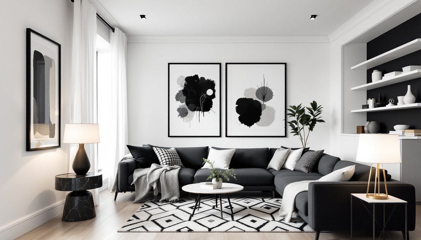
This is where black and white design separates the flat from the layered. A room with uniform matte black walls and white walls with no variation reads as a hotel hallway, not a home.
Texture adds visual interest without introducing new colors. A white linen sofa feels different from a white leather chair, which feels different from a white shag rug. Similarly, black velvet trim reads differently than black wood cabinetry or a black matte-finish accent wall. Matte absorbs light: gloss reflects it: semi-gloss sits in between.
Patterns, geometric tiles, striped wallpaper, houndstooth upholstery, break up large monochromatic fields and prevent monotony. A black and white checkerboard floor is more visually interesting than a single color, and gingham or damask patterns can soften spaces without introducing color. The key is restraint: one strong pattern per room usually works better than competing geometric prints. Many experienced decorators reference established design principles from sites like interior design tips and home styling guides when introducing patterns to high-contrast spaces, ensuring the visual weight stays balanced.
Practical Design Tips For Different Rooms
Living Spaces And Bedrooms
Living rooms are high-visibility zones where black and white design truly performs. Start with white walls and ceiling, this immediately enlarges the perceived space and makes natural light feel more abundant. Anchor the room with a dark sofa or sectional (black, charcoal, or deep gray), which creates visual weight and defines the seating zone. Layer in texture with throw pillows in different fabrics: linen, wool, velvet, or even knits. Add a patterned area rug (geometric, striped, or damask in black and white) to define the furniture grouping without introducing color.
Wall art, shelving, and accessories complete the story. Black-framed prints or photography against white walls create visual rhythm, and white shelving on black accent walls, or vice versa, adds depth. Lighting matters: brass or copper fixtures add warmth to what could otherwise feel cold: a white or black fabric lampshade softens glare without breaking the palette.
Bedrooms require a softer approach than living rooms. White walls and white ceiling remain your base, but the bedframe choice sets the tone. A black or charcoal upholstered headboard anchors the wall, while white bedding keeps the room from feeling cave-like. Layer in texture with a black throw blanket, patterned pillows, and a white or light gray rug. Nightstands can go either direction, but matching pairs usually feel intentional, two black side tables or two white ones, not one of each unless you’re deliberately playing with asymmetry.
In bedrooms, consider paint finishes carefully. Matte or eggshell finishes on walls absorb light and feel more restful, while semi-gloss on trim pops visually. Never use high-gloss interior latex on walls: it’s difficult to touch up, shows every dust particle, and reflects light unevenly. Primer matters too, use a stain-blocking primer before any dark wall color to prevent uneven coverage and ensure true color.
Kitchens and bathrooms are structural zones where black and white works best with material contrast. Black or white cabinetry reads decisively, while the opposite color dominates walls and backsplash. Subway tile, herringbone patterns, or checkerboard floors add visual interest without competing palettes. Materials, matte black metal hardware, white ceramic tile, stainless-steel appliances, create perceived depth and prevent the space from feeling flat.
One practical note: dark cabinetry requires more frequent cleaning to avoid dust and fingerprints showing. Matte black hides it better than gloss. Cabinet material also matters, solid wood or quality plywood holds paint and finish better than particleboard, and is worth the upfront cost if you’re committing to a 10+ year timeline. Many designers working on kitchen projects consult visual references through platforms like interior design trends and decorating ideas when refining cabinetry and material selections for high-contrast schemes.
Bringing Black And White Into Your Space: A Room-By-Room Approach
The smartest way to introduce black and white design is to start small and build confidence. Pick one room, usually a guest bedroom, powder room, or hallway, and commit fully. This lets you live with the contrast, see how light moves through the space across seasons, and understand whether the ratio feels right before tackling a high-traffic zone.
When implementing, prep work is non-negotiable. Walls must be clean, sanded if they’re previously painted, and primed before any dark color. Primer prevents bleed-through and ensures two coats of finish paint (a bare minimum for black walls) actually looks intentional, not transparent. Trim, baseboards, crown molding, door frames, should be caulked and filled before paint to avoid shadow lines that break the visual continuity.
For cabinetry, painting cabinets is doable as a DIY project, but it demands patience and proper surface prep. Sand the existing finish with 220-grit sandpaper, fill any gaps with paintable caulk, prime with bonding primer (which grips glossy surfaces), and apply two coats of cabinet-grade paint. Cabinet paint is formulated for durability and hardness: standard interior latex won’t hold up to daily opening and closing. Oil-based options cure harder but require longer drying time and ventilation: water-based cabinet paints are quicker and low-odor. Budget 2-3 weeks for the full process, including drying time between coats.
Flooring, whether tile, wood, or concrete, anchors the entire room. Black and white checkerboard tile is iconic for bathrooms and kitchens, but requires professional installation if you lack experience: grout lines and plumb are critical for the pattern to read correctly. Alternatively, a solid white or light tile with black accents or a border offers visual interest with simpler installation requirements.
Accessories and textiles are your adjustment dials. If the room feels too stark after paint and major pieces, layering soft goods, throws, rugs, curtains, and pillows, adds warmth without introducing color. Patterned textiles in black and white create visual texture and prevent the space from feeling like a showroom. Brass, copper, or matte-black hardware on doors, drawers, and fixtures completes the palette without breaking it.
One final consideration: lighting temperature. Warm white bulbs (2700K–3000K color temperature) feel more residential in black and white spaces than cool white (4000K+), which can amplify the starkness. Test bulbs in your fixtures before committing, as warm light softens contrast in a welcoming way.