![]()

Master Split Complementary Colors for Stunning Interior Design in 2026
A split complementary color scheme is one of the most versatile tools a homeowner can use to transform a room without major renovations. Unlike more complex color theory, this approach is straightforward: pick a base color, skip its direct opposite, and grab the two colors flanking that opposite instead. The result? Visual interest, balance, and harmony all rolled into one. Whether you’re repainting a bedroom, updating your kitchen, or redesigning a living space, understanding how to carry out split complementary colors can elevate your entire home’s aesthetic while keeping the look cohesive and intentional.
Key Takeaways
- A split complementary color scheme uses a primary color plus the two colors adjacent to its direct complement, creating visual interest and balance without the visual aggression of traditional complementary pairings.
- Split complementary color design works better for livable spaces than bold complementary or complex triadic schemes because it delivers depth and variety while preventing eye fatigue from constant visual stimulation.
- The 60-30-10 ratio—60% primary color, 30% dominant secondary, and 10% accent secondary—ensures balanced implementation across walls, large furniture, and small decor elements.
- Test your chosen palette using paint sample swatches observed under different lighting conditions and by living with accent pieces for a week before making major renovation commitments.
- Split complementary schemes are versatile across room types; use warmer bases and saturated colors in living areas and softer, less saturated versions in kitchens and bathrooms for sophisticated, functional results.
What Is a Split Complementary Color Scheme?
A split complementary color scheme starts with a primary color and uses the two colors adjacent to its true complement on the color wheel. Think of it this way: if blue is your base, its direct complement is orange. Instead of using orange, you’d use red-orange and yellow-orange, the colors sitting next to orange on either side.
This approach softens the boldness of straight complementary color pairing while maintaining visual punch and interest. It’s forgiving because the two secondary colors share similar undertones with each other, creating natural harmony. You’re not fighting the color wheel: you’re working with it strategically.
The practical advantage? You get contrast without jarring the eye. A room with blue walls and pops of red-orange and yellow-orange accents feels balanced and intentional rather than chaotic. This makes split complementary especially useful for DIYers who want impact without requiring a designer’s eye.
How It Differs From Other Color Schemes
Complementary schemes use two colors directly opposite on the wheel, think blue and orange at maximum intensity. Split complementary softens this by replacing one with two neighbors, reducing visual aggression while keeping energy alive.
Analogous schemes use three colors adjacent to each other (like blue, blue-green, and green), creating calm and unity. They’re soothing but can feel flat without accent colors. Triadic schemes space three colors equally around the wheel, which is bold and dynamic but harder to balance in practice.
Split complementary sits in the middle: it’s more dynamic than analogous, more livable than full complementary, and more balanced than triadic. It works because your brain perceives harmony from the two secondary colors while still getting excited by their collective contrast to the primary color.
Why Split Complementary Works for Home Interiors
Home interiors benefit from split complementary color schemes because they satisfy competing needs: visual interest and livability. You’re not just looking at a room once: you’re living in it for hours every day. A scheme that’s too bold exhausts the eye: one that’s too safe feels forgettable.
Split complementary delivers depth without fatigue. The two secondary colors create subtle variety, one might feel slightly warmer, the other slightly cooler, while still supporting the primary color. This prevents the “sameness” problem in monochromatic or analogous schemes.
Psychologically, the scheme also works because the color relationships feel natural. Your brain isn’t constantly correcting itself trying to process clashing hues. Instead, it settles into a rhythm where the colors feel like they belong together. This is why rooms designed with split complementary schemes often feel “finished” even with minimal furnishings.
Practically, it’s flexible. One secondary color can dominate accent walls or large furniture pieces (like a sofa), while the other accents smaller elements, throw pillows, artwork, trim. This distribution prevents either secondary color from overwhelming the space. Interior designers at resources like Homedit frequently recommend split complementary palettes for exactly this reason: maximum impact, minimum regret.
Practical Applications in Different Rooms
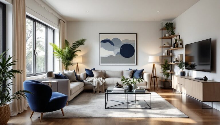
Living Rooms and Bedrooms
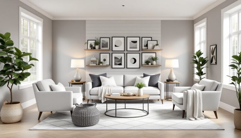
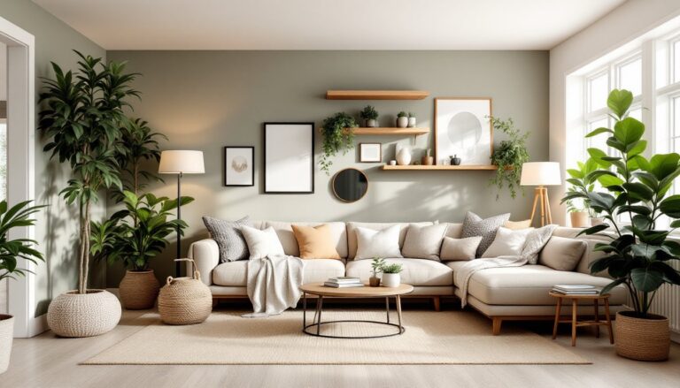
Living rooms thrive with split complementary schemes because they accommodate multiple functions and varying light conditions throughout the day. A common approach: soft gray as the base (neutral and calming), with dusty mauve and pale yellow-green as secondaries. The mauve might show up in accent pillows and a throw blanket, while the yellow-green appears as a potted plant accent or framed art. This combination keeps the room restful but engaging.
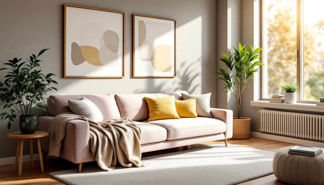
For bedrooms, consider warmer bases. Soft taupe with rust and terracotta accents creates warmth without intensity. Apply the darker secondary (rust) to an accent wall or headboard, and use the warmer secondary (terracotta) in bedding, curtains, or wall decor. This layering adds dimension while maintaining the relaxed atmosphere a bedroom needs.
The key in sleeping spaces is restraint. Let one secondary color dominate and use the other sparingly. A 60-30-10 ratio works well: 60% primary (walls, larger pieces), 30% dominant secondary, 10% accent secondary. This prevents the room from feeling overstimulated.
Resources like Home Bunch showcase how split complementary schemes work in real living spaces, proving that thoughtful color planning doesn’t require expensive renovations, just strategic paint and fabric choices.
Kitchens and Bathrooms
Kitchens are where split complementary really shines because they’re highly functional spaces that also need personality. If your cabinets are white (neutral base), you might paint the walls a soft sage green and add accents in coral and soft yellow. Coral appears in bar stools or artwork: yellow shows up in small appliances, dish towels, or backsplash tile details. This keeps the space from feeling sterile while maintaining easy visual navigation.
Bathrooms have different constraints: typically smaller, often with fixed tile or existing fixtures you’re keeping. Work around what’s there. If your existing tile is warm gray, build around it with a soft peachy-beige primary color on walls, then bring in accents of dusty coral and pale gold through towels, a shower curtain, or painted shelving. The existing gray becomes an unintentional fourth color, which actually strengthens the overall scheme.
One practical consideration: kitchens and baths benefit from slightly less saturated versions of your chosen colors. Paint companies like Benjamin Moore and Sherwin-Williams offer “color locator” tools online to find specific hex values and undertones. Less saturated versions of your split complementary palette will feel sophisticated rather than candy-colored. Interior design platforms like MyDomaine often detail how to modify color intensity for different room types, definitely worth exploring if you’re unsure about saturation levels.
How to Choose and Implement Your Split Complementary Palette
Start by picking a base color you genuinely love. This shouldn’t be overthought, it’s the color you’re drawn to, whether that’s navy, sage, warm gray, or blush. Write down what you love about it. Is it the calmness? The energy? This helps you commit when doubts creep in.
Next, find its complement on the color wheel (most free online tools do this instantly), then identify the two colors flanking it. You now have your three-color palette. But don’t jump straight to paint. Buy sample pots for all three and paint large swatches on cardboard or poster board. Tape them to your wall and observe them at different times of day. Morning light, afternoon light, and evening light reveal completely different sides of the same color. What looks fresh and bright at noon might feel sickly under evening incandescent bulbs.
Once you’ve committed to your three colors, decide the ratio. For most rooms, aim for 60% primary (walls, large furniture), 30% one secondary, and 10% the other. This prevents equal visual weight that can feel flat. In kitchens and bathrooms, you might push to 70-20-10 if the space is smaller or the primary is bold.
Implementation starts with the largest surfaces. Paint walls first, preferably with two coats of quality interior paint (expect 300-400 square feet per gallon coverage, depending on color depth and substrate). Use a primer-in-one formula for light colors: use primer separately for bold or dark colors to avoid multiple coats. Lightly sand walls between coats with 220-grit sandpaper for smoother finish. Then bring in secondary colors through furniture, textiles, and smaller decor. This order prevents expensive mistakes, if a wall color doesn’t work, repainting is cheaper than replacing a sofa.
Finally, test your chosen split complementary scheme before committing everything. Purchase one throw pillow in your dominant secondary color and one accent item in the other secondary color. Live with them against your walls for a week. You’ll know instantly if the palette sings in your actual light and space. For rooms where split complementary colors clash with southern interior design elements you’re keeping (inherited furniture, architectural features), adjust saturation or swap the secondary colors. Flexibility beats rigidity every time.