Transform Your Space: 7 Interior Home Decor Ideas That Elevate Any Room in 2026
Interior home decor ideas can feel overwhelming when you’re staring at a blank wall or a room that just doesn’t feel right. But here’s the thing: creating a space that actually works doesn’t require hiring a designer or blowing your budget. Whether you’re looking to refresh a single room or undertake a full home decorating overhaul, the strategies that make the biggest impact are often the simplest. This guide walks you through seven practical, actionable approaches that will help you elevate your space without overthinking it. From understanding how color affects your mood to arranging furniture so people actually flow through the room naturally, we’ll cover the fundamentals of interior design that transform a house into a home people actually want to spend time in.
Key Takeaways
- Interior home decor ideas don’t require professional designers or large budgets—simple, strategic changes like color, lighting, and furniture arrangement create the biggest impact.
- Choose warm colors for energizing spaces like kitchens and cool tones for calming bedrooms, then test paint samples on walls at different times of day before committing.
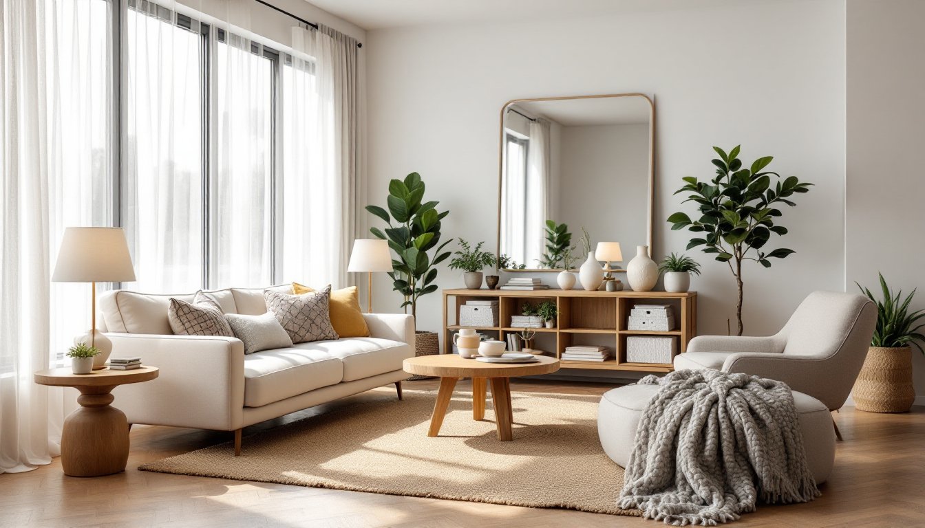
- Maximize natural light by positioning furniture thoughtfully, using sheer curtains, and placing mirrors opposite windows to bounce light throughout the room.
- Float furniture toward the center of rooms instead of pushing it against walls to create better flow, maintain at least 18 inches of walkway between pieces, and avoid oversized furniture in small spaces.
- Layer varied textures like soft rugs, woven accents, and mixed materials to add visual interest and make spaces feel intentional and lived-in.
- Rearrange existing furniture, shop thrift stores for secondhand pieces, and use DIY painting projects to refresh spaces affordably without professional help.
Color Psychology: Choose Hues That Enhance Your Home’s Mood
Color is the quickest way to shift how a room feels, and it’s worth understanding the basics before you crack open a paint can. Warm colors, reds, oranges, yellows, energize spaces and work well in kitchens, dining areas, and entryways. Cool colors like blues, greens, and purples calm the nervous system and pair well with bedrooms and home offices. Neutrals (grays, beiges, taupes) serve as reliable backdrops that let other design elements shine.
When choosing your palette, start with a base color that covers most of your wall space, then add one or two accent colors through accessories, trim, or an accent wall. A trick many overlook: paint samples directly onto your walls and observe them at different times of day. Sunlight dramatically changes how colors read. If you’re nervous about commitment, test paint in a closet or less-visible area first, a single gallon covers roughly 350 square feet with standard coverage.
Color theory explains how harmonious interior color schemes balance warm and cool tones, but the real test happens when you live with the color. Don’t rush this decision: most people regret bold color choices within six months because they didn’t give themselves time to adjust.
Maximizing Natural Light and Windows
Natural light is free decor that makes everything look better. It’s worth strategically planning your window treatments and furniture placement around light sources rather than fighting them. Start by assessing which walls get direct sun and when, morning light from the east is softer, while afternoon western light can be harsh and fading.
Keep window treatments minimal where possible. Sheer curtains diffuse bright light without blocking the view, while heavier fabrics work for bedrooms or media rooms. If privacy is a concern, consider cellular shades that tilt for light control without fully blocking windows. Avoid heavy drapes that soak up light: instead, hang them to the sides of windows so they don’t cover glass when open.
Mirrors are your silent partner in brightening a room. Place one opposite a window to bounce natural light deeper into the space. Large mirrors make rooms feel more open, but positioning matters, avoid creating glare on screens or uncomfortable reflections. Light-colored walls and furniture also amplify the effect of whatever sunlight you have. If your room lacks natural light, warm LED bulbs in lamps and fixtures can mimic daylight without the harsh blue-white tone of older LED technology.
Furniture Arrangement Strategies for Better Flow
How you arrange furniture determines whether a room feels spacious or cramped, inviting or awkward. Start by identifying the room’s focal point, a fireplace, TV, window view, or architectural feature. Arrange primary seating (sofa, chairs) to face this focal point and to help conversation between people in the room.
Avoid pushing all furniture against walls, which is instinctive but makes rooms feel colder and less intimate. Instead, float pieces toward the center if space allows. This defines zones in open-concept homes and makes smaller rooms feel intentional rather than empty. In tight spaces, a slim console table behind a sofa or floating shelves on walls recover vertical space without eating floor area.
Measure traffic patterns: people naturally move from entryways to other rooms in straight lines. Don’t obstruct these paths with furniture. A common mistake is oversized furniture in small rooms, a giant sectional shrinks a bedroom down, while the right-scale pieces (a loveseat instead of a full sofa) open it up. Leave at least 18 inches of walkway between major pieces. If rearranging feels daunting, start with one main piece and let others follow: you’ll quickly sense what feels balanced.
Layering Textures and Materials for Visual Interest
A room filled with smooth, shiny surfaces feels cold: one layered with varied textures feels lived-in and welcoming. Texture is the hidden ingredient in rooms that look designed rather than decorated. Start with hard surfaces (wood flooring, tile) and soft ones (rugs, curtains), then add tactile elements like linen throw pillows, woven wall hangings, or a knit blanket draped over furniture.
Material variety keeps the eye engaged. Pair a sleek metal side table with a wooden headboard and a soft upholstered chair. Mix matte and glossy finishes, a painted cabinet with a marble countertop, for instance. Plants introduce organic texture and improve air quality as a bonus. A chunky-knit throw over a leather sofa, a jute rug layered under a softer area rug, or linen curtains with wooden rings all speak the language of quality without feeling fussy.
Texture also hides imperfections. A textured paint finish or wallpaper with dimension forgives wall irregularities better than flat, glossy paint. If walls are a challenge, consider wood paneling, shiplap, or textured wallpaper as cost-effective alternatives. The key is balance, too many competing textures feels chaotic, while a few intentional ones create depth and sophistication.
Budget-Friendly Decor Swaps and DIY Alternatives
You don’t need to spend money on every interior design element to create impact. Some of the most effective decor is free or nearly free if you’re willing to spend time instead. Rearranging furniture costs nothing and often yields surprising results, try moving your bed to a different wall or pivoting your seating arrangement entirely.
Thrift stores and online marketplaces offer vintage finds and secondhand furniture at fractions of retail cost. A tired old frame spray-painted matte black becomes a statement piece. Old books stacked horizontally on shelves cost nothing if you own them, adding color and visual height variation. Repurposed glass jars hold flowers or serve as storage: fabric scraps become wall art or pillow covers.
DIY painting projects deliver outsized impact for minimal expense. A coat of paint transforms dated cabinets, old side tables, or wooden frames. Hardware swaps, new knobs or handles on existing furniture, feel custom. Growing herbs in small pots on a windowsill adds life and function. If you’re leaning toward coastal interior design or earthy interior aesthetics, many of these swaps naturally align. Wallpaper is another affordable change, remove it cleanly using a scoring tool and scoring solution, apply primer to walls, and install new paper or leave walls fresh for paint.
Accessorizing and Styling Shelves Like a Pro
Accessories are where rooms gain personality, but it’s easy to overdo it. The trick is editing ruthlessly. Choose pieces you genuinely love, not just filler. A well-styled shelf follows the rule of three: group objects in odd numbers for visual balance. Three books stacked horizontally, a plant, and a framed photo look intentional: five random objects scattered across a shelf look busy.
Vary heights, scales, and depths when styling shelves. Stand some items upright, lay books flat, lean artwork against the wall, and nestle smaller pieces in front of larger ones. Leave breathing room, empty space is as important as filled space and prevents a cluttered feel. In interior design contexts, negative space communicates intentionality.
Color coordination doesn’t mean matching: it means limiting your palette. If your space leans monochromatic, accessories in white, cream, and warm gray feel cohesive. If you’ve chosen bold accent colors, scale back accessories to prevent visual chaos. Modern design inspiration often highlights this restraint, less is genuinely more. Regularly swap out small items (throw pillows, artwork, books) to keep shelves feeling fresh without major investment.
Conclusion
Transforming your home doesn’t require a complete overhaul or a designer’s budget. These seven strategies, understanding color, maximizing light, arranging furniture thoughtfully, layering textures, embracing budget-friendly swaps, and styling accessories with intention, create spaces that feel designed, not decorated. Start with one room, apply one or two ideas, and observe what shifts. You’ll quickly discover which approaches resonate with how you live, and from there, the rest follows naturally.